

I love sports. But you know what I love almost as much as sports? Critiquing and ranking uniforms. Exciting highlights are probably going to happen regardless of what a team wears, but a great look can turn an exciting highlight into an iconic moment.
At this point in the winter, college football is over and the Braves seem to have stopped trading for the time being, which means I really miss baseball. To be totally transparent, given my relative lack of knowledge on the NBA and NFL compared to the other Sideline Warning writers, I figured it would be best to let them handle that. You know what’s more fun than writing an actual article? Ranking every MLB uniform!
So before we get started, here are some ground rules that you will see brought up throughout the rankings:
- These rankings are completely objective, free of bias, and 100% correct. If you disagree, it’s because you are wrong.
- I generally prefer more conservative, classic looking uniforms.
- In baseball, a home uniform should always display the team’s nickname, while the away uniform should always display the team’s location/city.
Bottom Tier: These uniforms have either crippling and outstanding flaws that make them easy to rank so low, or subtler yet significant mistakes that prevent them from reaching the middle tier.
30. Arizona DiamondBacks
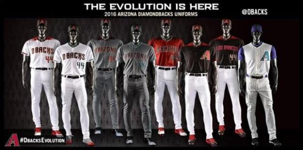
They were okay, but still probably bottom ten worthy, prior to #JoinTheEvolution. Now I’m just kind of in shock. Who approved this? Are you a proud member of the National League West or a twelve year old All-Star team? I can’t even tell which are the home jerseys and which are the away jerseys. Away jerseys are gray. I don’t see any gray. I see a weird silly dark coal-like color. I guess you have to go a little crazy when you sell all your good players to the Braves. Bonus points for the sweet vest throwback, too bad you can’t just wear those.
29. Miami Marlins

You are teal and black. Not teal, black, orange, and yellow. The old teal and black provided some of baseball’s most underrated looks.

Now, they suffer from far too many alternates, and a bright orange jersey is never a good idea. But at least they’re unique, and that counts for something. Like beating the DBacks.
28. Washington Nations

You have a Walgreens logo on your jersey.
I want the Expos back. These were some dang uniforms.


27. Cleveland Indians

While not offensive in any way… these just have nothing going for them. They keep it clean and simple, yet somehow manage to create a boring and ugly uniform. Negative points for being blue and red just like every other team in the league.
26. Colorado Rockies

If I could only make one rule for baseball uniforms, it would be as follows: your vest should never be the same color as the shirt under the vest. Second rule: your primary home uniform should be your best, your flagship, one that captures the essence of your franchise. Not that pin-striped mess. Luckily the Rockies have a clean and very well done away jersey to lift them this high in the rankings. Bonus points for having the unique purple. Negative points for not using it in your main uniform.
25. Milwaukee Brewers

When you can so obviously do so much better (see alternate four), why wouldn’t you? The basic home and aways are clean and not necessarily bad, but the away uniform commits the fatal flaw of displaying the nickname rather than the place of origin. Additionally, the set as a whole suffers from subtraction by addition. No one needs six uniforms.
24. Los Angeles Angels
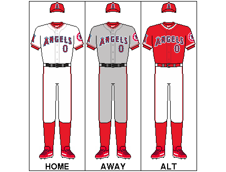
The “City of Angels Angels.” That makes as much sense as the “Los Angeles Angels of Anaheim.” I want to bust them for doing the “nickname instead of location” thing on the away uniform, but I kind of can’t because their nickname is technically the same as their city. What? Anyways, these are okay, just overly bland and boring. They only use one color, and those alternates look silly with lettering the same color as the jersey. I recommend going back to these:

23. San Diego Padres


I absolutely love the new home uniforms. The yellow accents make a huge difference and totally transform the uniform. The Padres now have one of the best single sets in baseball. I appreciate bringing back the brown in the alternate as well. However, the road uniforms opt not to use the yellow, and are therefore still boring. Now, the reason the Padres are this low despite the home uniform, and probably the most important thing I have ever written: camo is only appropriate for war and hunting, definitely not sports. I’m all for supporting the military, but this is an ascetically disturbing trend that has invaded all level of sport and now dominates youth leagues nation wide. But it’s so ugly. The blue Navy camo is a step up from the desert camo at least. Oh, and thank God the gold pants are gone.
22. Texas Rangers

Does anyone know what that Texas team that’s not the Astros is called? Looking at the uniforms, neither can I. That being said, this is a solid set of uniforms. They’re clean, and unlike most other teams the colored alternates actually work. But these are some remarkably plain uniforms. Break these out permanently, and the Rangers might jump to the top 10:

21. Tampa Bay Rays

At least their hats display where they’re from, because the away uniform takes a called third strike on that one. The home and away uniforms are solid if not plain, but the light blue and navy blue alternates just don’t work. The conservative plainness in the main uniforms can be forgiven considering the franchise’s brief history:


However, I always loved the unique green of their early to mid 2000’s look, which is their best.

Middle Tier: These uniforms are incredibly hard to rank because from this point on they are all good- but not great. They either have slight flaws, or lack the iconic status needed for a good uniform to be considered great.
20. New York Mets

One of the coolest things in sports to me is how the Mets combined the colors of the departed Dodgers and Giants to create their look. The primary away uniform is great, but they’re also the Mets. You’re not the Yankees, so don’t use pinstripes. Unless you add back the shoulder strips as modeled by Seinfeld star Keith Hernandez.

19. San Francisco Giants

I think a lot of people love the Giants uniforms, and they could be considered somewhat classic. So I’m sorry, but not really, when I say these just don’t work. Orange and black is a hideous combination, the colored alternates are offensively ugly, and the cream home uniform is pretentious. Unfortunately, they follow all the rules so I have to put them this high.
18. Philidelphia Phillies

Like the Angels before them, I can’t bust the Phillies like I want to for breaking the “nickname on away jersey” rule since their nickname is basically the city. As great as the cream alternate is, pinstripes suck and the road uniform is boring. Oh, and they’re the Phillies. It would be hard to win me over even if you broke these out:

17. Seattle Mariners

The Mariners’ basic home and aways provide for a solid set, and the throwback look of the new alternate is a nice plus. They’re clean and follow the rules, but the Mariners’ lose some points because their best player King Felix can’t really look good in any uniform.
16. Minnasota Twins


As the Padres have demonstrated, adding yellow accents is a great idea. And as you will certainly come to know, I’m not a pinstripe guy. So in my book, the Twins ditching the home uniform seen above for the new on the left is a big upgrade. The rest of the set looks pretty good and follows the rules, but it doesn’t do anything to make me fall in love.
15. Chicago White Sox

The White Sox do incredibly well for a team whose name is the blandest color possible. Like I’ve said and will say again, I’m not a pinstripe guy. But the away uniform is excellent and the black alternate works very well. I’m always a fan of throwback looks, so that’s a plus despite being totally disjointed for the rest of the set.
14. Detroit Tigers

Most people really love the old English D home uniform; I am not most people. Frankly, I find the Tigers’ home uniform plain and boring. Real life tigers are orange. Your logo is orange. So where is the orange? Add some orange accents like the Padres did with the yellow on their new home uniform and we might have a top ten set. Luckily, the away uniform utilizes all the team’s colors very well, resulting in a single uniform that is one of the league’s best. Bonus points for having no stupid alternates. Extra bonus points for carrying on the legacy of the legendary Billy Chapel, the only pitcher in major league history to throw a perfect game in his final start. Clear that mechanism, Billy.

13. Baltimore Orioles

Long live the cartoon bird!
12. Toronto Blue Jays

The Jays are right there with the Astros when it comes to recent upgrades from league-worst uniforms to very good uniforms. The result is a clean and unique set that follows the rules while updating their most successful style.


11. Atlanta Braves

The Braves are objectively the best franchise in professional sports, so it’s fitting that their uniforms are objectively the best of the Middle Tier. I mean, doesn’t looking at those uniforms just bring an overwhelming sensation of pride and loyalty? Okay, maybe that’t just me. But the Braves do have a solid home and away set that follows the rules and looks sharp despite suffering from slight clutter. Recent alternates have experimented with ditching the tomahawk, but I believe it should be retained since it provides the only unique aspect of the uniforms. On a final note, please remove the red alternate, burn all replicas of it, and never force me to watch it touch Turner Field/Sun Trust Park ever again.
Top Tier: These uniforms are either nearly flawless, or very good with history on their side. These were easier to rank because they’re my favorites.
10. Kansas City Royals

The defending World Series champs have an equally worthy set of uniforms. The basic home and aways are pretty perfect, but the set does suffer slightly from overcrowding. The light blue alternate sticks out like a sore thumb, not fitting with anything seen in the other uniforms or the team’s logo. If you want to evoke the classic 80’s powder blue, then by all means please go for it! But don’t stop at just the shirt. It’s mean to tease us like that.

9. Cincinnati Reds

There’s nothing negative I can say about these uniforms. They’re classics with a modern style, carrying on the iconic look of the Big Red Machine.


8. Chicago Cubs

I don’t love pinstripes, but it’s a classic part of a great set. The basic away uniform is one of baseball’s best, and the gray alternate is pretty cool despite breaking Away Uniform Rule Number One. The blue alternate is okay, but there’s lots of room for improvement.
7. Boston Red Sox

There’s not much to say bout these. They follow the rules, the alternates aren’t bad, and they overall look good. They’d don’t immediately stand out as excellent, but what else are the Red Sox supposed to do with their uniforms? I guess the away uniform could use some piping, maybe?
6. Oakland Athletics
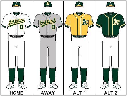
The white cleats, man. Lots and lots of bonus points for the white cleats. And green! Lots and lots of bonus points for being the only team that wears green! The basic home and aways are clean, follow the rules, and look great with the cursive and tail underneath. The alternates even work pretty well.
5. Pittsburgh Pirates

The Pirates have basic home and away uniforms that follow all the rules, looking clean without boring us. Unlike most, the colored alternate works. But what pushes the Pirates this high in the rankings is that stunningly beautiful throwback alternate, complete with elastic waste and awesome yellow hat. They could solidify their ranking by going back to these 90’s gems for their road look:

4. St. Louis Cardinals
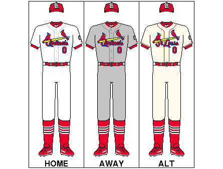
These uniforms are almost perfect. Almost. They’re clean,classic, and unique, but they break one major rule of baseball uniforms: your main road uniform should always display where you come from, not your nickname. Swap the logo from the alternate with the logo from the away uni and you might be looking at number one. Bonus points for the sweet socks.
3. Houston Astros

These just look like baseball uniforms. I could definitely do without the orange alternate, but besides that these are pretty flawless. The simple piping adds to the look without cluttering, and the relatively unique orange and blue combination meshes well and creates an original look. It helps that they’re such an improvement over these:

Plus bonus points every time they wear these:

2. New York Yankees

As you’ve seen with lower rankings, I’m not much of a pin stripe guy. But it’s the Yankees, and they’ve done it for like a hundred years, and frankly there’s probably no more recognizably uniform in sports. Objectively, they’re not my favorite. But I’m a human being on the planet earth and have therefore grown to appreciate them for tradition, and what is a clean, sharp look. I also greatly appreciate their reluctance to fall into the deadly trap of alternate uniforms. If it ain’t broke, don’t fix it.
- Los Angeles Dodgers

Everything about this uniform is perfect (except the alternate away uniform that says “Dodgers”). Classic and clean. The red numbers add the perfect amount of character without cluttering. Whether its Robinson, Koufax, or Kershaw wearing them, they’re beautiful.
